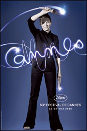
My “but” focuses on two things. With a face as enigmatic as Binoche, why is it so small in the overall photo? Would it not have been better to do a head shot? And what’s this big, dark slab of a shadow across her face?
Apart from that, the light-writing is a nice touch.
What do you think? Does anyone have any links to alternative Cannes festival posters? Could be fun!
