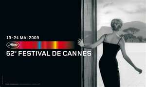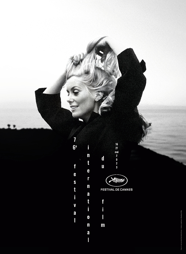
Edit: original article from 2012! As there is no hard news about the Cannes Film Festival 2012 yet, the release of the poster is always worth a few lines in the online press. This year’s poster continues the tradition of beautiful women related to cinema. The shot of a young Marilyn Monroe is certainly pretty, and one of the least-known photos of her. But I have a problem with this and the previous posters: how come the Cannes Film Festival posters all look like ads for Chopard?
How come the Cannes Film Festival posters all look like ads for Chopard?
What shapes Cannes as a festival?
The Cannes festival can be a pretty daunting high-brow affair some of the time. Some of the most remarkable careers started here, people like Coppola and Tarantino spring to mind. The Dardenne brothers are another example. Last year, the Palme went to the top-heavy “Tree of Life”. Lars Von Trier was a Cannes darling (and truth be told, he will remain so with juries and press but misplaced political correctness led to him being banned last year in 2011).
These characters shape Cannes as a festival and – dare I say it? – as a brand. But if you look at the images chosen over the past few years, there is a very clear trend. They all tend to be women, good-looking and very often based on nostalgia. Why? Cannes is a forward-thinking festival, yet there is an almost complete disconnect between what drives the festival – daring movies – and the images (such as the one for Cannes 2009 and the admittedly gorgeous shot of Faye Dunaway last year) which look like perfume ads.
 Niceness over relevance
Deep down, my problem with the Cannes festival posters globally is that they are surprisingly empty. They mean nothing and only evoke the past. I can see no reason for this, apart from the festival’s reliance on luxury goods as corporate sponsors. And let’s be honest: Marilyn Monroe is famous for a number of things. Her acting skills are not the first thing that spring to mind. So what sort of message are we getting?
Is there not room for a bolder approach, and one that uses the considerable graphic skills available in France? The Quinzaine des Réalisateurs tend to have better images. Should the festival itself not be leading in this field, rather than creating postcards?
I’m aware as I write this (2012) that there are people giving gasps of pleasure at the Marilyn Monroe poster (and it is a nice photo). I’ve seen words such as “sublime” and “iconic” being bandied about. But should we really be celebrating one of cinema’s most mediocre actresses at the world’s most exciting festival? If I think of women that represent the spirit of Cannes, it would probably be closer to Björk. How about you?


Pingback: Quinzaine unveils its 2012 poster
Hiya, I am really glad I have found this information. Nowadays bloggers publish just about gossips and web and this is really annoying. A good blog with interesting content, that is what I need. Thanks for keeping this website, I’ll be visiting it. Do you do newsletters? Can not find it. gdeddcdekkkd