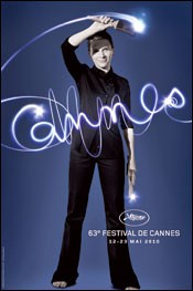
 To answer a question I was asking myself yesterday, no I’m not the only one to be a little under-whelmed by the Cannes Festival 2010 poster. The comments I have been hearing could be summed up globally as, “Love Juliette Binoche as an actress, but…”
My “but” focuses on two things. With a face as enigmatic as Binoche, why is it so small in the overall photo? Would it not have been better to do a head shot? And what’s this big, dark slab of a shadow across her face?
Apart from that, the light-writing is a nice touch.
What do you think? Does anyone have any links to alternative Cannes festival posters? Could be fun!

I like the poster. At first glance it reminded me of a demonstration Pablo Picasso once did. Of course, Juliet Binoche is a lot easier to look at than Picasso ever was.
Binoche/Picasso: you certainly have a point there!
Michael